
Color Cardstock vs Cotton Paper for Letterpress Invitations
June 5, 2025
Let’s talk paper, because when it comes to letterpress invitations, the paper isn’t just a background. It’s one of the first things people notice, and it can completely shape the tone of your suite. Choosing between color cardstock vs cotton paper is one of those decisions that can feel small at first, but ends up having a big impact on the final piece.
One of the decisions I help clients make often is whether to go with a soft, cotton stock or something with a bit more color and personality. There’s no one-size-fits-all answer, and both options can be beautiful in very different ways.
Here’s how I usually break it down.
Cotton Paper: The Classic Letterpress Favorite
Cotton is the paper most people associate with letterpress. It’s soft, absorbent, and takes the impression beautifully. If you’re someone who loves that deep, tactile print, cotton is where it really shows up.
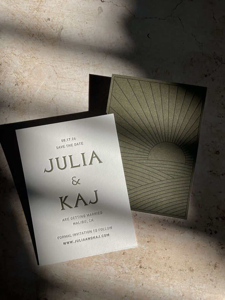
One thing to note with cotton: since it usually comes in white or off-white, if you’re keeping costs down and opting for a single ink color, that’s likely the only color you’ll see across your piece. With color cardstock, we can play more. The paper itself can add a second layer of color or contrast, without the added cost of another ink run.
Pros:
- Takes the letterpress impression really well
- Has a soft, refined feel in hand
- Neutral shades make ink colors pop
- Often made from recycled materials (usually from textile byproducts)
Cons:
- Limited in color — you’re mostly working with whites or creams
- Can be a little more delicate when mailing
- Tends to be a bit pricier than other stocks
Cotton is a great fit if you’re after that soft, textured feel and a clean backdrop for your design. Even though historically, deep impression wasn’t the original goal of letterpress, cotton is where it really shows up. I wrote more about that in this post on kiss vs. bite.
You can absolutely bring in bold color with cotton, but it often means adding more ink runs or choosing a specialty cotton stock, which can increase the budget. Still, if you’re drawn to that pillowy impression or a more refined feel, it’s the one to go with.
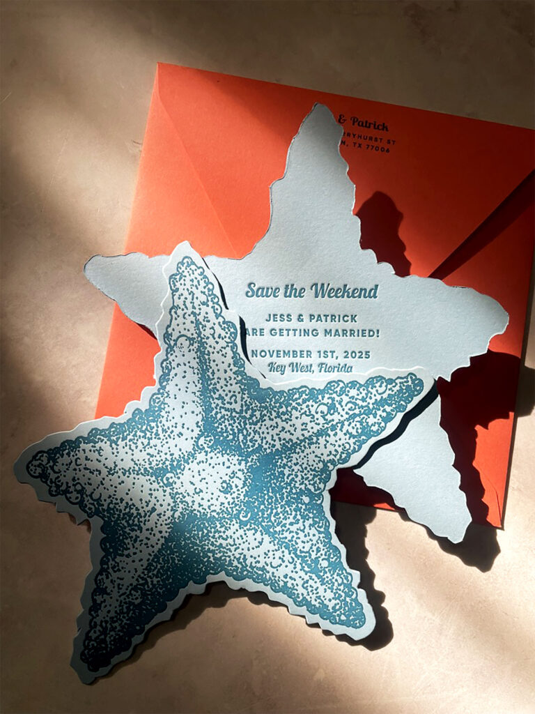
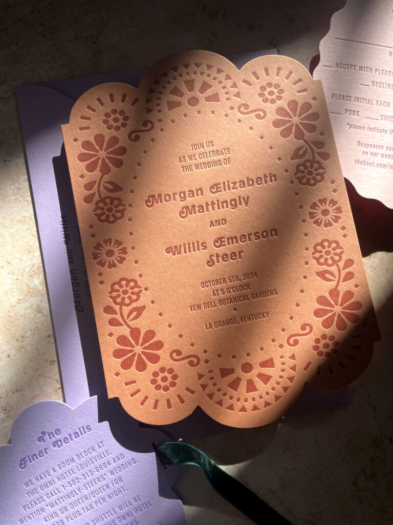
Color Cardstock for Letterpress: Bold and Playful
This is the paper you go to when you want to make a statement before anyone even reads a word. Color cardstock brings a different kind of energy to a suite. It’s modern and bold.
That said, it behaves very differently on press. We also have to be mindful of what ink colors we pair it with. Because letterpress inks are translucent, we can’t print light ink on dark paper and expect high contrast. Not all colors play nicely with every stock, so flexibility is more limited when working with colored paper.
Pros:
- You get built-in color without having to flood print a background
- Great for more playful or unconventional palettes
Cons:
- The impression won’t be as deep (color stocks are harder and less yielding)
- Light ink doesn’t show well on dark paper due to ink translucency
- Not all color stocks take letterpress equally well (some are more finicky than others)
- Fewer ink color combinations work well due to the translucency of letterpress ink
Color cardstock is fun, and when it works, it really works. But it does come with its quirks, which is something we have to consider before committing. If you’re driven by a color-drenched invitation, then I would more than likely suggest colored cardstock.
Colored Handmade Cotton: The Best of Both (At a Cost)
There’s also a third category worth mentioning: handmade cotton paper that comes in color. It gives you the best of both worlds. You get the soft texture and deep impression of cotton, along with a subtle tint or bold color baked right in.
Pros:
- Takes a letterpress impression beautifully like traditional cotton
- Adds color without compromising that handmade, tactile feel
- Unique and artisanal; no two sheets are ever exactly alike
Cons:
- Comes at a higher price point
- Color palette is more limited and tends to vary batch to batch
This is a great option if you’re after a natural, painterly feel with a hint of color, and your budget allows for something a little extra.
How to Choose Between Color Cardstock vs Cotton Paper for Letterpress
It really depends on the kind of invitation you want to send into the world.
If you’re drawn to soft texture and that deep letterpress impression, cotton might be the way to go. It can feel classic or striking, depending on how we play with ink and layout. If you’re looking for something vibrant and unexpected, color cardstock might be the move. And sometimes, the answer is both. I’ve had clients do their main invitation on cotton and their details card or RSVP on a fun color for contrast. That mix can make the whole suite feel more dynamic and layered.
That said, cotton can be trickier to print on than people expect. It’s softer, but that doesn’t always make things easier. It absorbs ink differently, and the results can vary depending on the press, humidity, and even the batch of paper. Color cardstock is firmer and more predictable in some ways, but also less forgiving if we want a deep impression. Each comes with its own learning curve, and part of the process is knowing how to work with those quirks.
Some of my favorite suites have come from clients who were willing to try something a little unexpected. Those moments often lead to the most memorable pieces I’ve made.
Whether you’re leaning toward soft neutrals or saturated color, there’s always a way to make the paper work in your favor. In the end, the right choice is the one that supports the tone and spirit of your celebration. It’s not just about what looks good, but about what feels right.

Got a project in mind and not sure where to start? Let’s talk through the options and find the paper that fits both your budget and your story.
Cartulina de Color vs Papel de Algodón para Invitaciones en Letterpress
Hablemos de papel, porque cuando se trata de invitaciones imprimidas en letterpress, el papel no es simplemente un fondo. Es una de las primeras cosas que la gente nota y puede definir por completo el tono de tu papelería. Elegir entre cartulina de color o papel de algodón es una de esas decisiones que al principio parecen pequeñas, pero que al final tienen un gran impacto en el resultado final.
Una de las decisiones que suelo ayudar a tomar a mis clientes es si optar por un papel de algodón o algo con un poco más de color y personalidad. No hay una única respuesta válida, y ambas opciones pueden ser igual de bonitas, pero de formas muy distintas.
Así es como suelo explicarlo.
Papel de algodón: el clásico del letterpress
El algodón es el papel que la mayoría asocia con el letterpress. Es suave, absorbente y capta la impresión de forma preciosa. Si eres de las personas que disfrutan esa huella profunda y táctil, el algodón es donde realmente luce.
Un detalle a tener en cuenta: como el papel de algodón suele venir en blanco o tonos marfil, si buscas una opción más accesible y optas por un solo color de tinta, es probable que ese sea el único color visible en todo el diseño. Con cartulina de color, tenemos más margen de juego. El propio papel puede aportar una segunda capa de color o contraste, sin necesidad de añadir una pasada extra de tinta.
Ventajas:
- Capta muy bien la impresión del letterpress
- Tiene una textura suave y refinada al tacto
- Los tonos neutros hacen que los colores de tinta resalten
- A menudo se fabrica con materiales reciclados (normalmente subproductos textiles)
Desventajas:
- Limitado en colores: sobre todo blancos o marfil
- Puede ser algo más delicado para el envío
- Suele ser más caro que otros papeles
El algodón es una gran opción si buscas esa textura suave y un fondo limpio para tu diseño. Aunque históricamente el letterpress no se concibió para dejar una impresión tan marcada, es justo en el algodón donde más se nota. Escribí más sobre esto en este post sobre “una impresión mordida vs. beso”.
Puedes incorporar un color llamativo con papel de algodón, pero normalmente implica más pasadas de tinta o elegir un papel especial, lo que puede aumentar el presupuesto. Aun así, si te atrae esa textura tipo “almohadilla” o buscas un acabado más elegante, es una opción que merece la pena considerar.
Cartulina de color: atrevida y divertida
Este es el papel al que recurrimos cuando queremos causar impacto incluso antes de que alguien lea una sola palabra. La cartulina de color aporta una energía muy distinta a una invitación. Es moderna y con carácter.
Dicho esto, se comporta de forma muy distinta en la prensa. También tenemos que tener en cuenta los colores de tinta con los que lo combinamos. Como las tintas de letterpress son translúcidas, la tinta clara sobre papel oscuro no da buenos resultados. No todos los colores combinan bien con todos los papeles, así que hay que tener cierta flexibilidad al trabajar con cartulinas de color.
Ventajas:
- El color viene integrado sin necesidad de imprimir un fondo
- Ideal para paletas más atrevidas o poco convencionales
Desventajas:
- La impresión no será tan profunda (es un papel más duro y menos flexible)
- La tinta clara no se aprecia bien sobre papel oscuro por la transparencia de la tinta
- No todos los papeles de color se comportan igual de bien con letterpress (algunos son más delicados que otros)
- Hay menos combinaciones de tinta que funcionan bien
La cartulina de color es divertida, y cuando funciona, realmente destaca. Pero también tiene sus matices, algo que siempre comento antes de decidirnos. Si lo que te mueve es una invitación llena de color, lo más probable es que recomiende cartulina de color.
Algodón artesanal de color: lo mejor de ambos mundos (con un precio)
También hay una tercera opción que vale la pena mencionar: papel de algodón artesanal que viene en color. Es la forma perfecta de tener lo mejor de los dos mundos. Obtienes la textura suave y la impresión profunda del algodón, pero con un matiz sutil o un color intenso ya integrado en el papel.
Ventajas:
- Capta la impresión del letterpress tan bien como el algodón tradicional
- Aporta color sin perder esa sensación artesanal y táctil
- Es único y artesanal; no hay dos hojas exactamente iguales
Desventajas:
- Tiene un precio más elevado
- La gama de colores es más limitada y puede variar entre lotes
Es una opción excelente si buscas una estética más natural o pictórica con un toque de color, y tu presupuesto te permite algo un poco más especial.
Cómo elegir entre cartulina de color y papel de algodón
Todo depende del tipo de invitación que quieras enviar al mundo.
Si te atrae la textura suave y esa impresión profunda del letterpress, el algodón puede ser tu mejor opción. Puede sentirse clásico o llamativo, dependiendo de cómo juguemos con la tinta y la composición. Si buscas algo energético y fuera de lo común, la cartulina de color puede ser el camino. Y a veces, la mejor decisión es una combinación. Algunos clientes han elegido papel de algodón para la invitación principal y un color divertido para la tarjeta de detalles o el RSVP. Esa mezcla puede darle al conjunto un toque dinámico y equilibrado.
Ahora bien, imprimir en algodón puede ser más complejo de lo que parece. Es más suave, pero eso no siempre facilita las cosas. Absorbe la tinta de manera distinta, y los resultados pueden variar según la prensa, la humedad e incluso el lote de papel. La cartulina de color es más firme y, en algunos aspectos, más predecible, pero también menos tolerante si buscamos una impresión profunda. Cada opción tiene su curva de aprendizaje, y parte del proceso es saber adaptarse a sus particularidades.
Algunos de mis proyectos favoritos han surgido gracias a clientes dispuestos a probar algo diferente. Esos momentos suelen dar lugar a las piezas más memorables.
Tanto si prefieres tonos neutros como si lo tuyo es el color saturado, siempre hay una manera de que el papel juegue a tu favor. Al final, la elección adecuada es la que acompaña el tono y el espíritu de tu celebración. No se trata solo de lo que se ve bonito, sino de lo que se siente correcto.
¿Tienes un proyecto en mente y no sabes por dónde empezar? Hablemos de las opciones y busquemos el papel que mejor encaje con tu historia y tu presupuesto.


