
Destination Wedding Invitations: Let the Place Lead
November 3, 2026
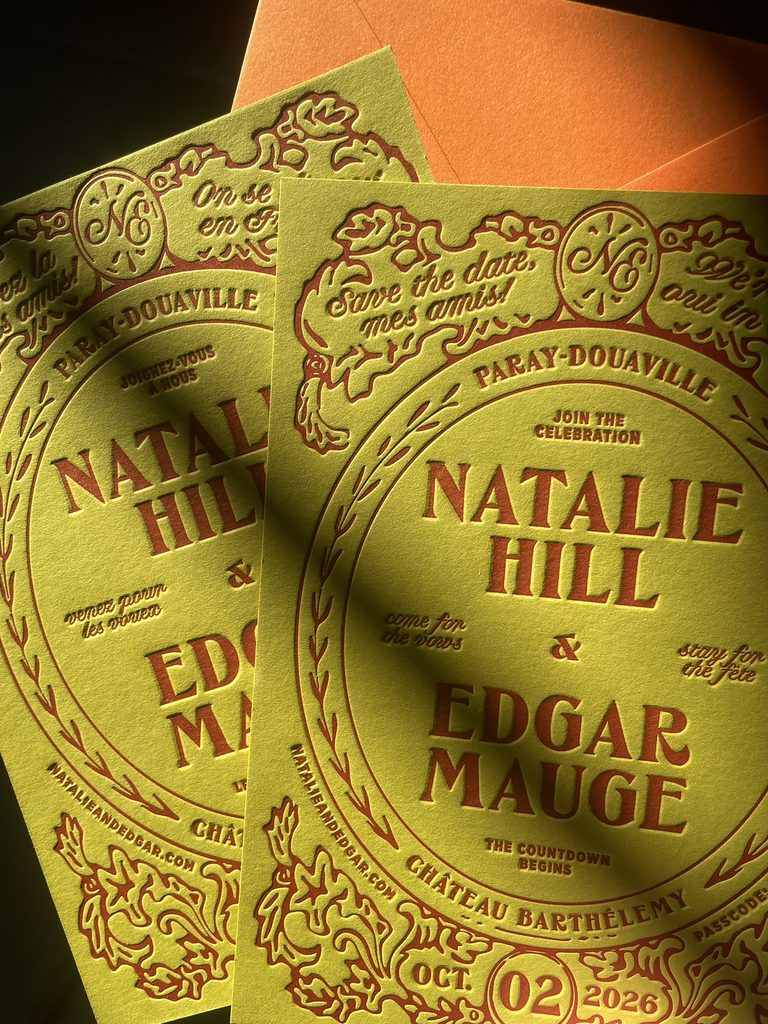
A destination wedding gives you a starting point for the design, and one of my favorite things about working on these projects is having a place to research. There’s so much to draw from, and it doesn’t always come from the obvious things. A building, a color combination, an old sign, or something you discover while reading about the local culture can take a design in a direction you wouldn’t have found by looking at wedding invitations alone. But the location is only part of it. The best designs also reflect the couple, the kind of weekend they’re planning, and the references that make the project their own. Here’s where I like to start when turning a place into paper.
Research the Location
When I start working on invitations for a destination wedding, I spend time getting to know the place beyond the venue itself. I look at architecture, local typography, old posters, menus, signage, native wildlife and the colors and patterns that show up in everyday life. Sometimes the most useful reference isn’t something traditionally associated with weddings at all. It might be the lettering on a storefront, a vintage travel poster, or the way colors are used together in a local market.
I’m not looking to copy these references directly or make a literal illustration of the destination. I’m looking for details that can inform the design, whether that’s a particular type style, an unexpected color combination, the shape of a card, or a small detail carried through the suite. Research gives us more to work with, and often leads to ideas that feel much more specific to the place
Start With the Couple, Too
The destination gives us a starting point, but it doesn’t tell us everything about the design. I also want to know what the couple is drawn to, whether that’s bold typography and color, something more understated, or a collection of references that don’t seem to have much in common at first. That’s often where things get interesting: combining elements from the location with references that have nothing to do with it. A wedding in the Italian countryside doesn’t automatically need a rustic aesthetic, a coastal wedding doesn’t have to be blue and white, and a formal celebration in a historic venue can still have a playful design. It’s about finding the right combination rather than following a particular look just because it suits the setting.
I also think about the kind of weekend they’re planning. Is it a relaxed gathering with everyone staying in the same place, a formal celebration in a historic setting, or a few days of dinners and events across a city? Those details can help shape the stationery, from the overall tone of the invitation to how the information is organized and what other pieces might be useful.
Find Your Colors in Unexpected Places
Color is one of the easiest ways to reference a destination, but it doesn’t need to be an obvious interpretation of the landscape. Instead of pulling only from the sea, the countryside, or the buildings, I like looking at the smaller details: painted doors, market produce, vintage packaging, textiles, tilework, or the colors used in local signage. These references can lead to palettes that feel connected to a place without relying on the usual combinations.
I also consider how the colors will work together in print. Letterpress inks have their own character, and the paper underneath plays a big part in how a color appears. Because the ink is pressed into the stock rather than sitting on top like a digital print, the finished result has a different feel. Choosing the palette is as much about how those colors behave on paper as it is about how they look on a screen.
Play With Shape and Format
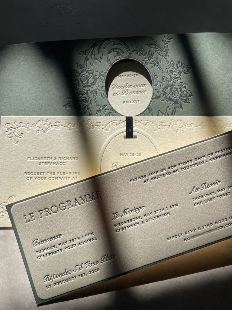
The shape and format of an invitation can do more than hold the wording. A custom die-cut, an unusual proportion, or a smaller card layered with the main invitation can introduce a visual idea without spelling out the destination. Sometimes a simple change in format is all a design needs to feel distinctive.
I tend to think about these decisions in relation to the typography and the rest of the suite, rather than adding a shape just for the sake of it. A die-cut can be a great detail, but it also affects production, cost, and how the pieces fit together. The goal is to find a format that adds something to the design and feels considered as part of the whole, not an extra element that doesn’t quite belong.
Give Typography a Proper Role
Typography is often where the personality of an invitation comes through most clearly. The right typeface can feel architectural, playful, formal, or a little nostalgic without needing much else around it. I look at the typographic references that came out of the research, then consider how they work with the couple’s preferences and the information that needs to be included.
I’m especially interested in the contrast between type styles, scale, and spacing. A strong headline paired with a quieter supporting typeface can create a lot of character, while a more restrained layout can make an unusual typeface the focus. The destination might influence the direction, but the typography should still feel like a design choice rather than a theme applied to the invitation.
Think About the Paper and Printing
Paper and printing are part of the design, not just the final production decisions. The weight, color, and texture of the stock can change the way the entire invitation feels. I often consider how the paper will work with the palette and typography, and whether the suite would benefit from layering different stocks or keeping things simple with one beautiful, substantial piece.
Letterpress is especially suited to designs where typography, color, and the feel of the paper are doing the work. The impression left in the stock gives the finished piece a physical quality that you don’t get from a flat print. Not every invitation needs multiple printing methods or elaborate finishes, either. Sometimes one ink color on the right paper is enough. I prefer choosing the production methods because they support the design, rather than adding techniques simply to make a suite more elaborate.
Don’t Forget the Rest of the Suite
The invitation is usually the starting point, but destination weddings often involve more information and more events than a single-day celebration. Depending on the plans, the suite might include a details card, an RSVP card, travel information, or a separate piece for the welcome party or other weekend events. The challenge is making everything clear while keeping the design cohesive.
I like to think about how the pieces relate to one another from the beginning. That doesn’t mean every card needs to look identical. Typography, color, paper, and small recurring details can tie the suite together while giving each piece its own purpose. And if the couple plans to carry the stationery into the wedding day, those same elements can inform menus, place cards, signage, and other printed pieces, creating a consistent visual language from the first invitation to the celebration itself.
A Few Practical Things to Plan For
Destination wedding invitations have a few extra logistics to consider, particularly when guests need to arrange travel. It’s worth thinking about what information guests need, how they’ll access it, and whether the invitation suite is the best place for all of it. A details card can be useful for the essentials, while a wedding website can hold more extensive travel information, accommodation recommendations, and updates.
Timing matters, too. For a destination wedding, couples often send save-the-dates around nine to twelve months ahead, with invitations typically going out around six months before the wedding. The right timing will depend on the destination, travel requirements, and guest list, so it’s worth working backward from the dates and allowing enough time for design, printing, assembly, and international shipping if needed. Getting started early gives us more room to make design decisions without rushing production.
Let the Place Inspire the Design, Not Dictate It
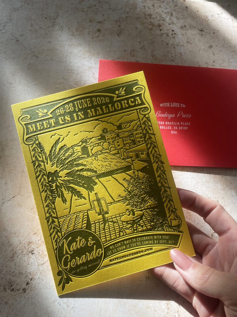
The destination can give an invitation a lot of character, but I don’t think the design needs to explain the location at every turn. The most interesting results often come from a mix of references: something specific to the place, something personal to the couple, and a few unexpected details that bring it all together.
At Bodega Press, I approach destination wedding stationery through graphic design, typography, color, paper, and old-school printing. The aim isn’t to make an invitation that could belong to any wedding in that location, but to create something that feels right for that particular couple and celebration.
If you’re planning a destination wedding and want to explore what your invitations could look like, get in touch with Bodega Press. I’d love to hear where you’re getting married and what you’re imagining for the paper.


