
Paper and Color in Wedding Invitation Design
April 18, 2025
Traducción en Español al final*
There’s something special about paper and color when it comes to wedding invitation design. Long before I understood the mechanics of letterpress, I remember the joy of flipping through old notebooks, running my fingers along textured covers, or peeling open the edge of a special envelope, the kind you just knew held something meaningful. Paper holds emotion, even when it says nothing at all.
Recently, I was reminded of this truth in a very real way. I had my heart set on a very specific colored envelope for a project, one that felt just right. Not too bold, not too soft, with a depth that perfectly captured the tone of the entire suite. But, as it often happens in this work, the envelope was unavailable. It wasn’t in stock, and I found myself purchasing an alternative.
I moved forward with the rest of the suite, but that envelope still lingered in the back of my mind. Eventually, I found another stationer kind enough to sell me a stash she had tucked away. It was the exact color I had been searching for. When I finally held it in my hands and placed it with the rest of the pieces, it all came together. That subtle shift in tone grounded everything. The suite didn’t just look complete, it felt complete. It reminded me that sometimes, the details we’re tempted to compromise on are the ones worth holding out for.
I’ve always been unwavering in my approach. When I envision something, I tend to pursue it to fruition, regardless of the challenges I may face and regret in the moment. I’ve never been one to settle for anything less than what feels right. It’s a blessing and a downfall of my tenacious personality. But moments like this remind me why it’s worth waiting for the missing piece.
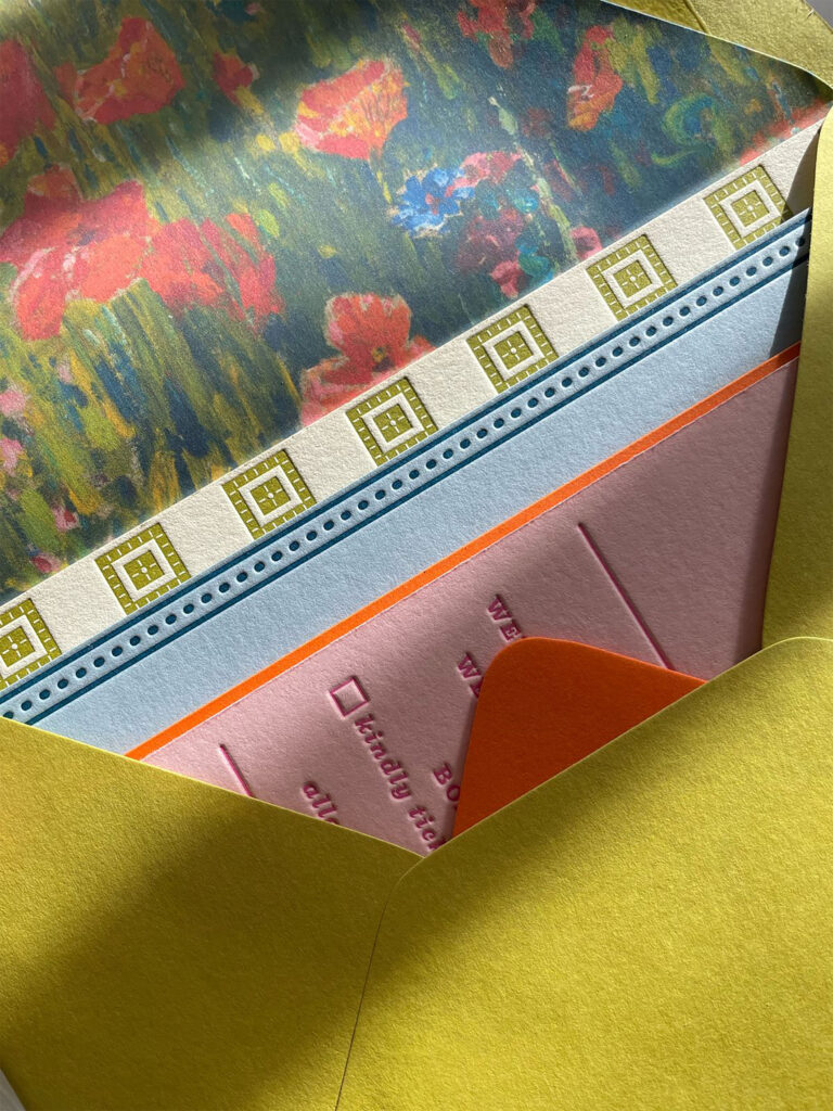
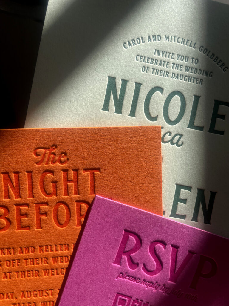
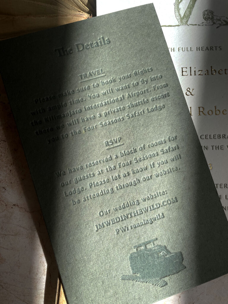
Because paper and color aren’t just a surface to print on. They are part of the story. Sometimes the biggest difference lies in the tiniest variation of texture or hue. A soft cotton stock might feel like your grandmother’s linen drawer, gentle, familiar, sentimental. Handmade paper with raw edges feels intimate and unpolished in the most beautiful way. A heavier smooth stock carries elegance, confidence, and a hint of restraint. These decisions may seem small, but they’re deeply emotional. They linger.
And then there’s color. Color works in quiet harmony with paper and plays a huge role in wedding invitation design. Color brings the heartbeat. Not in a loud way, but in the way a candle can warm a whole room. A soft blush printed on creamy paper feels like a daydream or a handwritten love letter. That same blush on bright white becomes more playful, even a bit cheeky. Rust on toothy paper evokes autumn walks and earthy vows. Navy on smooth stock might feel classic and collected, while navy on handmade paper says, we wanted to do things differently, and with feeling.
It’s in these subtleties that the magic happens. The paper stock and color palette don’t shout. They whisper. But if you’re paying attention, they say everything. They tell your story before your guests even begin to read.
Because the goal isn’t to impress. It’s to connect.
It’s why I ask couples for images that represent their vision, whether it’s the colors, textures, or moments that speak to them. I want the materials to mirror who they are, not just in design, but in emotion.
If you’re dreaming of stationery that feels like an extension of you, whether soft and nostalgic, bold and unexpected, or somewhere in between, I’d love to help bring that vision to life.
Let’s create stationery that speaks your language.
With love,
BP
El Papel y el Color en el Diseño de Invitaciones de Boda
Hay algo especial en el papel y el color cuando se trata del diseño de invitaciones de boda. Mucho antes de comprender la mecánica de la impresión en letterpress, recuerdo la alegría de hojear viejos cuadernos, pasar los dedos por cubiertas texturizadas o abrir la esquina de un sobre especial, de esos que sabes que contienen algo significativo. El papel tiene emoción, incluso cuando no dice nada en absoluto.
Recientemente, me recordaron esta verdad de una manera muy real. Tenía mi corazón puesto en un sobre de color muy específico para un proyecto, uno que se sentía justo. Ni demasiado audaz, ni demasiado tenue, con una profundidad que capturaba perfectamente el tono de toda el conjunto. Pero, como suele suceder en este trabajo, el sobre no estaba disponible. No estaba en stock, y me vi obligada a comprar una alternativa.
Seguí adelante con el resto de la invitación, pero ese sobre seguía rondando en mi mente. Eventualmente, encontré a otro diseñadora que estuvo dispuesta a venderme una reserva que había guardado. Era el color exacto que había estado buscando. Cuando finalmente lo sostuve en mis manos y lo coloqué con el resto de las piezas, todo encajó. Ese pequeño cambio de tono lo ancló todo. La invitación no solo se veía completa, se sentía completa. Me recordó que, a veces, los detalles con los que estamos tentados a comprometernos son los que realmente valen la pena esperar.
Siempre he sido de piñón fijo en mi enfoque. Cuando imagino algo, lo persigo hasta verlo realizado, sin importar los desafíos que pueda enfrentar y el arrepentimiento momentáneo. Nunca he sido de conformarme con algo menos de lo que siento que es lo correcto. Es una bendición y una caída de mi personalidad tenaz. Pero momentos como este me recuerdan por qué vale la pena esperar la pieza que falta.
Porque el papel y el color no son solo una superficie para imprimir. Son parte de la historia. A veces, la diferencia más grande radica en la más pequeña variación de textura o tono. Un papel de algodón suave podría sentirse como el cajón de lino de tu abuela, cálido, familiar, sentimental. El papel hecho a mano con bordes crudos se siente íntimo y sin pulir de la manera más bonita. Un papel liso y pesado transmite elegancia, confianza y un toque de restricción. Estas decisiones pueden parecer pequeñas, pero son profundamente emocionales. Perduran.
Y luego está el color. El color acompaña al papel con sutileza y es esencial en la composición de una invitación de boda. El color trae el latido. No de manera ruidosa, sino como lo haría una vela que calienta toda una habitación. Un tono suave de rubor impreso en papel cremoso se siente como un sueño o una carta de amor escrita a mano. Ese mismo rubor sobre blanco brillante se vuelve más juguetón, incluso un poco descarado. El caldera sobre papel rugoso evoca caminatas otoñales y votos terrenales. El azul marino sobre papel liso podría sentirse clásico y sereno, mientras que el azul marino sobre papel hecho a mano dice, queríamos hacer las cosas de manera diferente, y con sentimiento.
Es en estos matices donde ocurre la magia. El tipo de papel y la paleta de colores no gritan. Susurran. Pero si estás prestando atención, lo dicen todo. Cuentan tu historia antes de que tus invitados siquiera comiencen a leer.
Porque el objetivo no es impresionar. Es conectar.
Por eso les pido a las parejas que me compartan imágenes que representen su visión, ya sean los colores, las texturas o los momentos que les hablen. Quiero que los materiales reflejen quiénes son, no solo en el diseño, sino en la emoción.
Si estás soñando con una papelería que se sienta como una extensión de ti, ya sea sútil y nostálgica, audaz e inesperada, o en algún lugar intermedio, me encantaría ayudar a hacer realidad esa visión.
Creamos invitaciones que expresan lo que las palabras no alcanzan.
Con cariño,
BP


