
Deboss vs. Emboss Printing: Key Differences & How to Choose
February 27, 2025
*Traducción en Español al final de la publicación en Inglés*
Debossing and embossing are two striking techniques that add depth and dimension to paper, each creating a distinct tactile effect. While both are associated with letterpress printing, they achieve opposite results—deboss vs. emboss printing comes down to whether the design is pressed into the paper or raised above it. Understanding the difference can help you choose the perfect finish for your stationery.
What Is Debossing? (A.K.A. Letterpress Printing!)
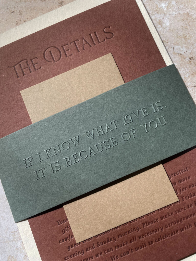
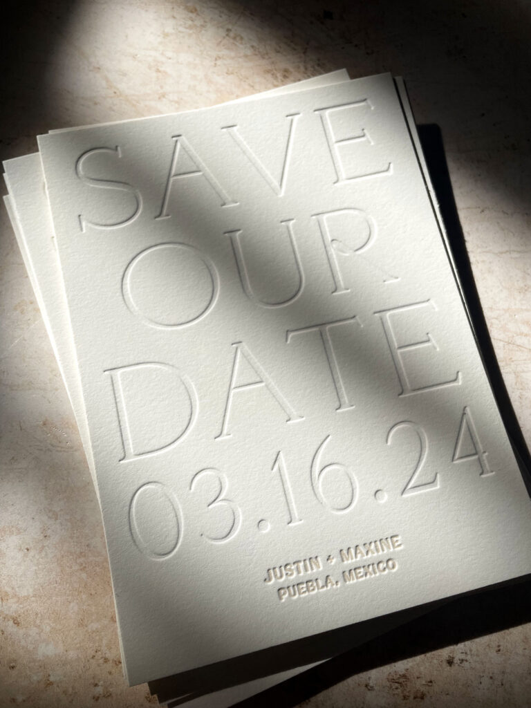
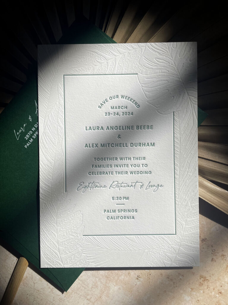
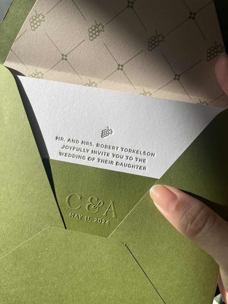
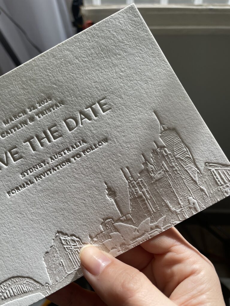
Debossing is the heart of letterpress printing. This technique presses a design into the paper, creating a recessed impression that sinks below the surface. It can be done with ink (for a rich, printed look) or as a blind impression (without ink) for a purely tactile effect. The result? A beautifully textured finish that enhances the depth of your design.
Why We Love Debossing:
- Works beautifully with both inked and blind impressions.
- Complements a variety of styles—it can be vibrant with bold colors or subtle with soft tones.
- Adds dimension and a refined, artistic presence.
- More budget-friendly: Debossing typically requires only one plate per color, making it a more cost-effective option compared to embossing.
Design Aesthetic:
Debossing works well for designs that highlight rich color, modern typography, and intricate detailing. It pairs beautifully with minimalist layouts, contemporary patterns, and organic, hand-drawn elements where the impression itself becomes part of the design.
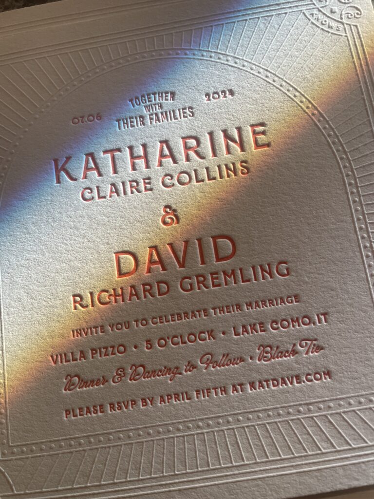
What Is Embossing?
Embossing flips the script. Instead of pressing into the paper, the design is raised above the surface, adding a sense of dimension and grandeur. Unlike debossing, embossing does not use ink—the raised effect is created solely by the impression. However, it can be paired with foil stamping for an extra touch of shine and contrast.
Why We Love Embossing:
- Highlights key details with a bold, dimensional effect.
- The raised texture creates a sense of sophistication and refinement.
- When paired with foil, it enhances contrast and adds a touch of luxury.
- If debossing is a whisper, embossing is an exclamation—confident, attention-grabbing, and undeniably elegant.
Design Aesthetic:
Embossing is ideal for monograms, intricate flourishes, and formal invitations. It shines in designs that require a sense of prestige, making it a favorite for luxury stationery, logos, and high-end branding.
Deboss vs. Emboss: Which Printing Style Is Right for You?
It all comes down to the feeling you want to create:
Choose Deboss (Letterpress) if you love a modern, textured look that speaks through depth and color. It’s a craft-centered technique, perfect for designs where richness and subtlety coexist. It’s also a great choice for a more budget-friendly option.
Choose Emboss if you want to make a statement. It’s dimensional, elegant, and undeniably eye-catching. Keep in mind that embossing involves a higher cost due to the setup complexity.
Why Not Both?
We love blending techniques to create stationery that feels dynamic and unexpected. A mix of embossing and debossing can add contrast and depth, making your design feel layered and truly one of a kind.
Let’s Make Something You Can Feel
Whether you’re drawn to the classic elegance of deboss vs. emboss printing, both techniques celebrate the beauty of craftsmanship and paper. We’re here to help you choose the perfect details to bring your vision to life.
Let’s create something that’s not just seen, but felt. Get in touch to start designing today.
Bajo Relieve vs. Alto Relieve: ¿Cuál es el mejor para tu papelería?
El bajo relieve y el alto relieve son dos técnicas impresionantes que añaden profundidad y dimensión al papel, cada una con un efecto táctil único. Aunque ambas están asociadas con la impresión letterpress, logran resultados opuestos. La diferencia entre ambas radica en si el diseño se presiona hacia dentro del papel o se eleva sobre la superficie. Comprender esta diferencia te ayudará a elegir el acabado perfecto para tu papelería.
¿Qué es el Bajo Relieve? (También conocido como Letterpress)
El bajo relieve es el alma de la impresión letterpress. Esta técnica presiona un diseño en el papel, creando una impresión hundida que queda por debajo de la superficie. Se puede realizar con tinta (para un efecto más definido y con color) o como impresión en seco (sin tinta) para un acabado puramente táctil. ¿El resultado? Una textura elegante que realza la profundidad de tu diseño.
Por qué nos encanta un Bajo Relieve
- Funciona perfectamente tanto con y sin tinta.
- Se adapta a una variedad de estilos. Puede ser llamativo con colores intensos o sutil con tonos claros.
- Añade dimensión y una presencia artística refinada.
- Es una opción más accesible. Generalmente, el bajo relieve requiere solo una plancha por color, lo que lo hace más económico en comparación con el alto relieve.
Estética del Diseño
El bajo relieve es ideal para diseños que resaltan el color, la tipografía moderna y los detalles intrincados. Se combina perfectamente con composiciones minimalistas, patrones contemporáneos y elementos orgánicos dibujados a mano, donde la impresión en sí misma forma parte del diseño.
¿Qué es el Alto Relieve?
El alto relieve es justo lo contrario. En lugar de presionar el diseño dentro del papel, lo eleva por encima de la superficie, creando una sensación de volumen y elegancia. A diferencia del bajo relieve, el alto relieve no usa tinta. Su efecto elevado se logra únicamente con la impresión, aunque se puede combinar con hot stamping para un toque extra de brillo y contraste.
Por qué nos encanta un Alto Relieve
- Resalta detalles clave con un efecto llamativo y dimensional.
- La textura elevada transmite sofisticación y elegancia.
- Cuando se combina con hot stamping, realza el contraste y añade un toque de lujo.
- Si el bajo relieve es un susurro, el alto relieve es una exclamación. Seguro de sí mismo, impactante y lleno de carácter.
Estética del Diseño
El alto relieve es perfecto para monogramas, detalles ornamentales y invitaciones formales. Destaca en diseños que buscan transmitir prestigio, lo que lo convierte en una opción favorita para papelería de lujo, logotipos y branding de alta gama.
Bajo Relieve vs. Alto Relieve: ¿Cuál es el estilo adecuado para ti?
Todo depende de la sensación que quieras transmitir.
- Elige Bajo Relieve (Letterpress) si te encanta un acabado moderno con textura que combina profundidad y color. Es una técnica artesanal perfecta para diseños que equilibran riqueza visual y sutileza. También es una opción más accesible en términos de presupuesto.
- Elige Alto Relieve si quieres hacer una declaración. Es dimensional, elegante y absolutamente llamativo. Ten en cuenta que el alto relieve implica un costo más alto debido a su proceso de producción.
¿Por qué no ambos?
Nos encanta combinar técnicas para lograr efectos sorprendentes en la papelería. La mezcla de alto y bajo relieve aporta contraste y dimensión, haciendo que tu diseño cobre vida de una manera única.
Creamos algo que se pueda sentir
Ya sea que te atraiga la elegancia clásica del bajo relieve o el impacto visual del alto relieve, ambas técnicas celebran la belleza del papel y la artesanía. Estamos aquí para ayudarte a elegir los detalles perfectos y hacer realidad tu visión.
Hagamos algo que no solo se vea, sino que también se sienta. Contáctanos para comenzar a diseñar hoy mismo.


