
Letterpress Kiss vs. Bite: Understanding the Difference
February 14, 2025
*traducción en Español al final de la publicación en Inglés*
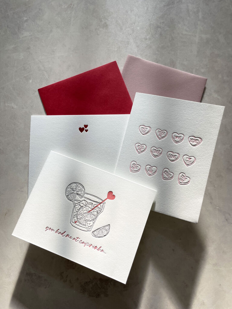
In honor of Valentine’s Day, let’s talk about kisses and bites—the sweet kind, the passionate kind, and, if you’re in the world of letterpress, the printing kind. When it comes to letterpress kiss vs. bite impression, there’s a delicate balance between a soft kiss of ink and a deep, tactile bite into the paper, both romantic in their own way, both leaving a lasting impression. The choice between a kiss or bite impression comes down to style, tradition, and the feeling you want to evoke.
The Kiss: Subtle, Elegant, and True to Tradition
In the early days of letterpress, the kiss impression was the standard. It was a light, barely-there touch that transferred ink to the paper with subtle elegance. It was about restraint, simplicity, and preserving the integrity of the paper. This technique leaves a light touch of the printing plate on the surface of the paper. The design is printed without deeply pressing into the paper, creating a clean, subtle look with minimal indentation.
A kiss impression results in a smooth finish with just the slightest trace of texture, making it perfect for a vintage, minimalist, or understated aesthetic. It’s also gentle on thinner papers, making it ideal for delicate or lightweight materials.
Why the Kiss Impression Was the Standard
The kiss impression was once considered the hallmark of good printing. Leaving a bite impression was seen as poor craftsmanship. The goal was precision and clarity, not texture. This is largely because traditional letterpress printing was designed for mass production, like newspapers, books, and commercial prints, where efficiency and type longevity were key. Metal or wooden type would wear down or break under too much pressure, so printers prioritized a gentle touch to preserve their materials for repeated use. Pressing too hard risked damaging the type, making it unusable for future prints. Many old-school printers refuse to embrace the modern bite impression because it goes against everything they were taught about proper technique.
The Bite: Bold, Textured, and Full of Feeling
Today, however, the bite impression has become the star of the 21st century. Bold and deeply tactile, the bite impression presses designs into the paper with noticeable depth, creating a luxurious and dramatic effect. It’s a favorite among modern couples and designers who want their stationery to stand out, not just visually, but as an experience you can feel. While both impressions have their place, the bite impression perfectly captures the spirit of contemporary letterpress: bold, striking, and undeniably memorable.
Ironically, the very thing that was once considered a mistake, pressing too hard and creating an indentation, became the defining feature of letterpress’s revival. When letterpress made its grand return, it wasn’t because people wanted to replicate traditional printing methods. It was because they fell in love with the deep, tangible beauty of the bite impression. Thanks to modern materials like photopolymer and zinc plates, which won’t wear down or break under pressure, today’s printers can achieve this luxurious effect without compromising the integrity of their tools. This evolution is what makes the letterpress kiss vs. bite impression debate so interesting—tradition versus innovation, subtlety versus depth.
At Bodega Press, we’re all about the bite impression. Bold, tactile, and full of character. We craft wedding invitations that don’t just look beautiful, but feel unforgettable. Because great design isn’t just about what you see, it’s about what stays with you.
So whether you’re drawn to the gentle elegance of a kiss impression or the bold depth of a bite impression, remember that letterpress is about more than just what’s printed on paper. It’s about creating a feeling, a memory, a touch of something real. At Bodega Press, we’re honored to craft designs that leave an impression in every sense of the word, from the first glance to the last touch.
Which impression speaks to you? Let’s make your stationery unforgettable. Reach out to us today to start your custom design journey.
En honor a San Valentín, hablemos de besos y mordiscos: los dulces, los apasionados y, si te mueves en el mundo del letterpress, los de impresión. Cuando se trata de la impresión de letterpress de beso o mordisco, hay un equilibrio delicado entre un suave beso de tinta y un mordisco profundo en el papel. Ambos son románticos a su manera, ambos dejan huella. La elección entre un beso o un mordisco depende del estilo, la tradición y la sensación que quieras evocar.
el beso: sutil, elegante y fiel a la tradición
En los primeros días del letterpress, el beso era la norma. Un toque ligero, casi imperceptible, que transfería la tinta con elegancia sutil. Se trataba de contención, simplicidad y de respetar la integridad del papel. Esta técnica deja una leve huella de la placa de impresión sobre la superficie sin hundirse demasiado, logrando un acabado limpio y delicado con una mínima marca.
El resultado es una impresión suave con apenas un rastro de textura, ideal para un estilo vintage, minimalista o discreto. Además, es perfecta para papeles más finos, lo que la convierte en una opción ideal para materiales delicados o ligeros.
por qué el beso era el estándar
El beso era, en su momento, el sello de una buena impresión. Un mordisco en el papel se consideraba un error técnico. El objetivo era la precisión y la claridad, no la textura. Esto se debía a que el letterpress tradicional estaba diseñado para la producción masiva de periódicos, libros y material comercial, donde la eficiencia y la durabilidad de los tipos eran clave. Las piezas de metal o madera se desgastaban o rompían con demasiada presión, por lo que los impresores priorizaban la suavidad para preservar su equipo. Presionar demasiado fuerte podía dañar los tipos y hacerlos inutilizables para futuras impresiones. A día de hoy, muchos impresores de la vieja escuela siguen rechazando el mordisco moderno porque va en contra de todo lo que aprendieron sobre la técnica correcta.
el mordisco: audaz, con textura y lleno de carácter
Hoy en día, el mordisco se ha convertido en el protagonista del letterpress en el siglo XXI. Profundo y táctil, el mordisco presiona el diseño en el papel con un relieve marcado, creando un efecto lujoso y dramático. Es el favorito de muchas parejas y diseñadores modernos que quieren que su papelería no solo destaque visualmente, sino que también se sienta al tacto. Aunque ambas impresiones tienen su encanto, el mordisco captura perfectamente la esencia del letterpress contemporáneo: audaz, impactante e inolvidable.
Irónicamente, lo que antes se consideraba un defecto —presionar demasiado y dejar una hendidura— terminó definiendo el renacimiento del letterpress. Su regreso no se debió a un deseo de replicar la impresión tradicional, sino al amor por la profundidad y la belleza tangible del mordisco. Gracias a materiales modernos como las placas de fotopolímero y zinc, que no se desgastan ni rompen con la presión, los impresores de hoy pueden lograr este efecto sin comprometer sus herramientas. Esta evolución es lo que hace tan interesante el debate entre beso y mordisco en letterpress: tradición versus innovación, sutileza versus profundidad.
En Bodega Press, nos encanta el mordisco. Audaz, táctil y lleno de carácter. Creamos invitaciones de boda que no solo son bonitas a la vista, sino inolvidables al tacto. Porque un gran diseño no es solo lo que se ve, sino lo que permanece.
Así que, tanto si te atrae la elegancia sutil del beso como la profundidad marcada del mordisco, recuerda que el letterpress es mucho más que tinta sobre papel. Es una sensación, un recuerdo, un toque de algo real. En Bodega Press, nos sentimos honrados de crear diseños que dejan huella en todos los sentidos, desde la primera mirada hasta el último roce.
¿Cuál impresión va más contigo? Hagamos que tu papelería sea inolvidable. Escríbenos y comencemos a diseñar juntos.


